Screen Shot Saturday & Devlog - October 24, 2020
This was a bit of a slow week in terms of what we have to show, but not actually a slow week in terms of what we got done.
You see… the Turncoat Universe—where Republic Sniper take place—has a secret. It’s a really big secret that we intended to slowly reveal over the course of the original Turncoat game. When we scaled back our plans and Turncoat morphed into the original Republic Sniper game, that secret became more of a background element that would inform world building, but didn’t have a direct impact on the main story. Our plan had been to hint at it a bit, but save the reveal for the future when we hopefully would have the chance to go back and create the original game.
We did quite a bit of story work this week, and had an epiphany that will allow us to use the original Turncoat secret in Republic Sniper Resurrection in a way that will actually drive a bunch of our game mechanics. We’re really excited about what we came up, and wish we could share the details, but we’d be spoiling our own game in kind of a big way if we did. Suffice it to say that the story revisions ate a fair amount of our time this week and spurned the writing of a whole bunch of new story and side quests, dialog, and codex entries.
As a result of our story focus this week, we don’t have as much visual stuff to show off as we have the last two weeks, but we do have a couple of things.
More Map Expansion
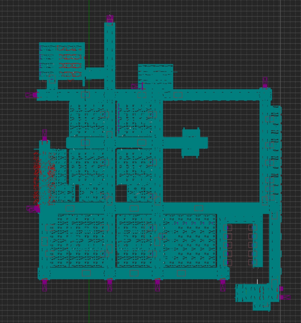
When we decided to split the original first map into two maps, we knew that the new starting map needed a few things. We knew it needed a barracks, and we also knew it needed some smaller training ranges because of where we decided to end the first demo. Beyond that, the only thing we knew we needed was a hangar or docking collar or some place where your character could board the ship, to serve as the game start. Those weren’t enough spaces to make the level feel like you were onboard a real spaceship, though, and wasn’t really enough content for the first milestone demo.
All the story work we did this week has helped give us a better idea of what other areas the map needs and what other quests and encounters will happen in those areas.

As a result, we were able to expand the map quite a lot this week. There’s (ballpark) twice as much navigable space as before. The big empty spaces inside the blocked-out corridors mostly have a purpose now and are just awaiting somebody to have the time to go in and finish blocking them out.
Last week, we mentioned the row of tightly packed doors that were enabled by moving from horizontally-opening doors to vertical ones. We now know that those are going to be NCO quarters, but we liked the idea of having dedicated space on the ship to let soldiers get away from everyone else. It seems like a necessary item for Deep Fleet ships operating two million kilometers from Earth that only gets shore leave about once a year.
There was a scene in one episode of Battlestar Galactica (2004) where people were being allowed into the ship’s observation deck for limited time intervals as a sort of vacation for people who didn’t have any way to take a vacation. It was a really short scene that wasn’t strictly necessary to move the plot forward, but it was a lovely piece of world-building and we appreciated that the writers gave thought to the psychological impact of the character’s circumstances.
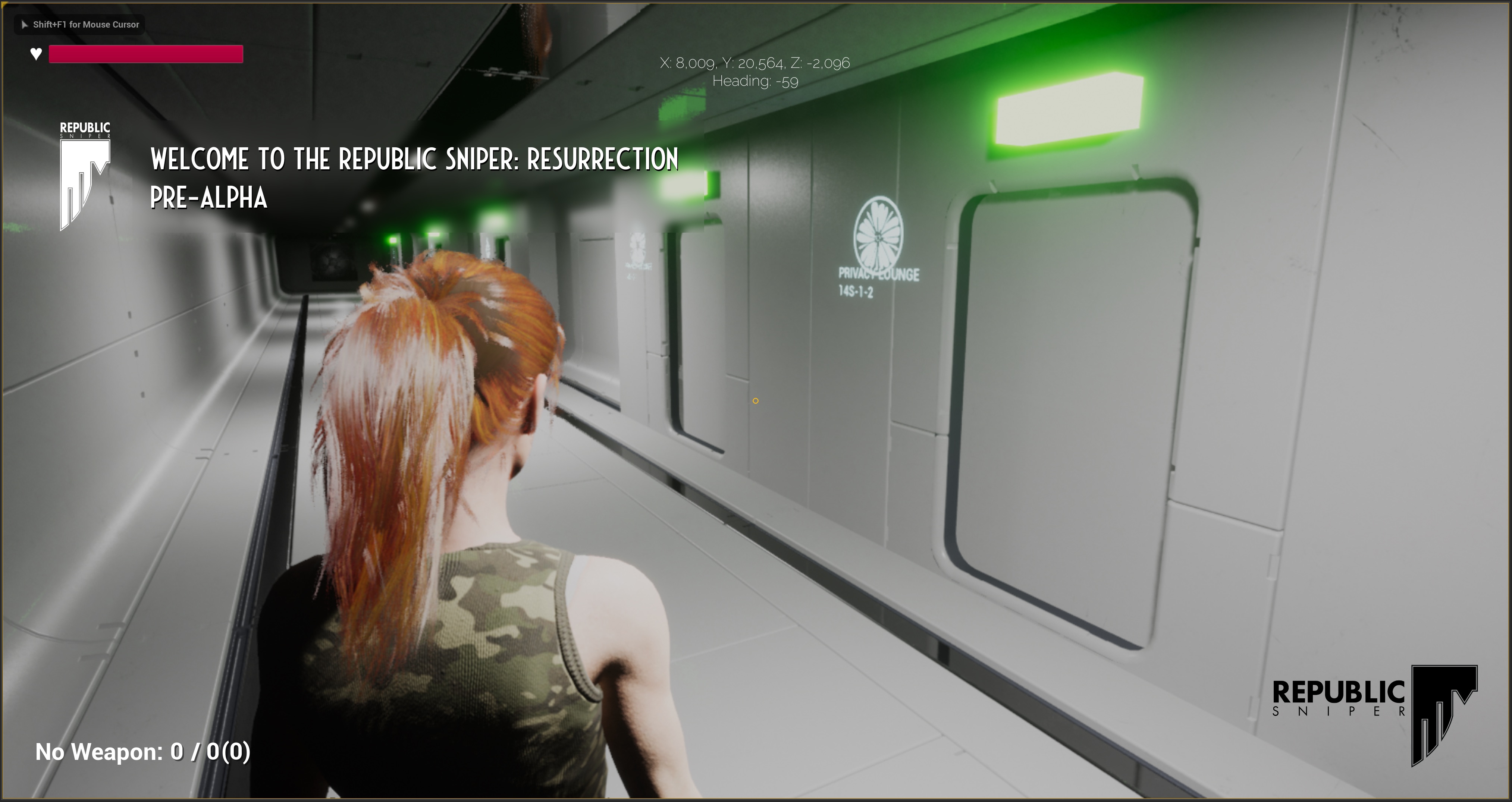
This week, we added a row of “privacy lounges” to serve that same purpose, and gave them a view of Mars and Phobos. Unlike the Galactica, these ships were designed to function under these circumstances, so the ship designers would likely have taken crew morale and psychology into account.

Some of the people in that Battlestar Galactica episode were using their time in the observation deck like a date, which also seemed logical, so we made the rooms a few different sizes to accommodate both individuals, couples, and small groups who wanted to hang out together apart from the bustle of the working parts of the ship.
The COVID-19 lockdown we’ve all been going through really drove home for us the potential mental impact of being cooped up with a lot of other people for a long time.
Glinting Loot
Old school games used to make loot items that you could pick up ridiculously large so you would see them. That doesn’t look right with modern graphics on high resolution screens, though, so we wanted to keep loot objects at their actual size. Unfortunately, some of our pick-ups became hard to find. Many games deal with that by giving you a special kind of vision that makes it easier to separate items you can pick up. We didn’t want to go that route, though.
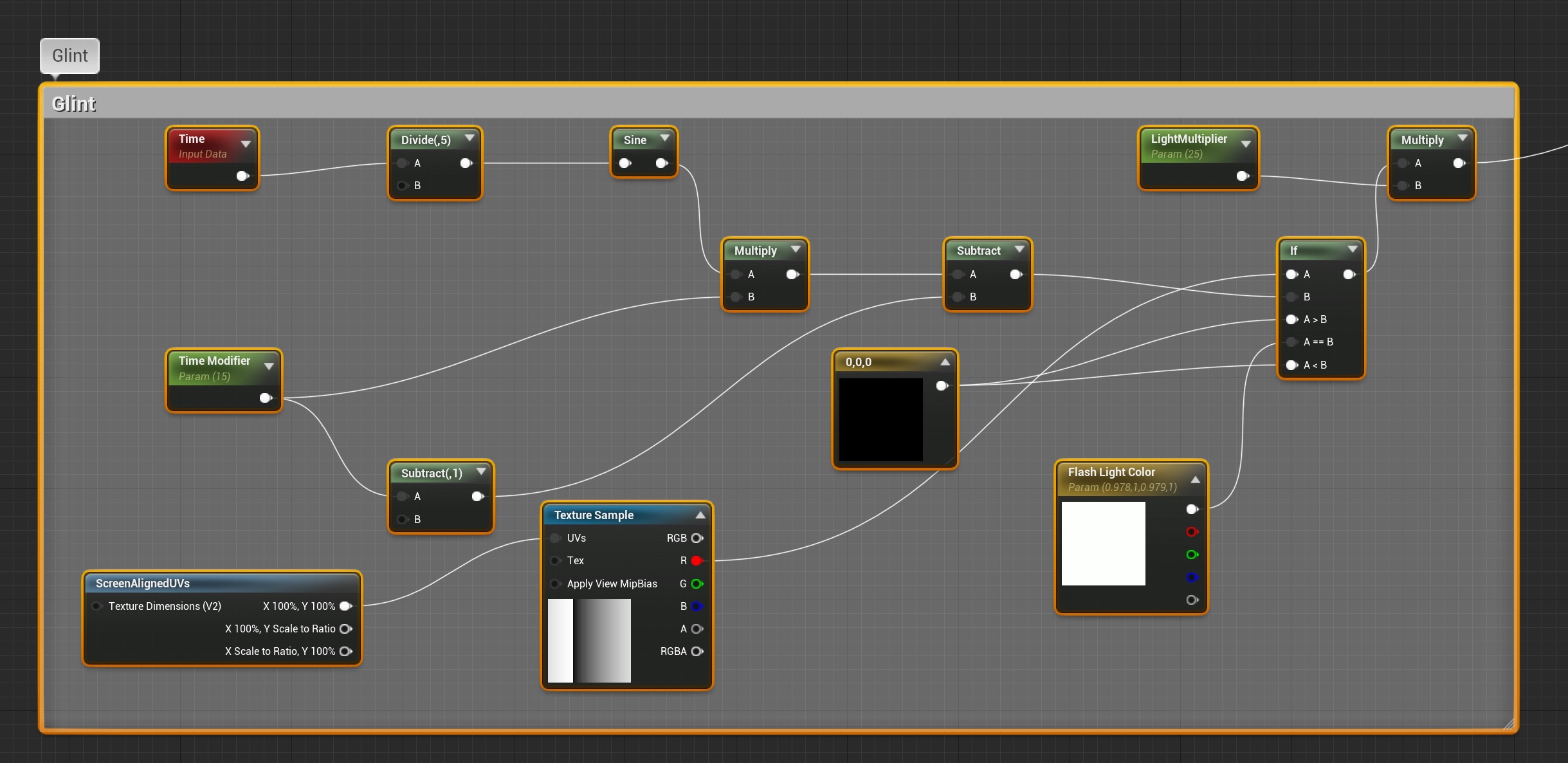
Instead, we implemented a mechanic borrowed from Bioshock, which is that items that you can pick up will occasionally “glint”. It’s a pretty subtle effect compared to Bioshock’s: just the briefest flash of light every once in a while to help the user find objects without resorting to some kind of special vision, which really doesn’t fit the game’s lore, at least when you’re on board your own ship and not geared up for combat.
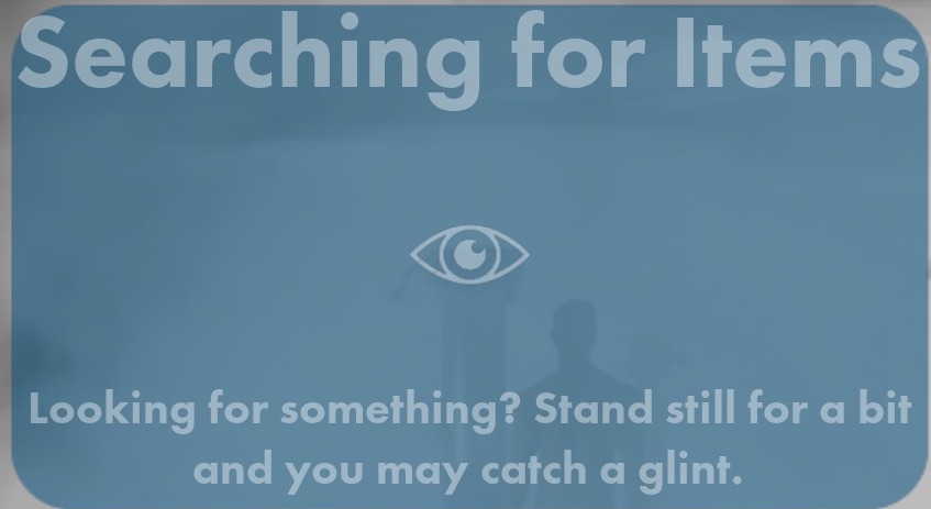
We also added a quest and tutorial specifically designed to teach the player about this mechanic.

Here you can see the material nodes that feed into the object’s emissive pin to create this glint, if you’re interested.

You can see the effect in the video in the next section.
Inspectable Objects
One game mechanic we knew we needed, but hadn’t gotten around to implementing, was the ability to pick up and and rotate an item from the world to get a closer look at it. You’ve probably seen a similar mechanic in a bunch of games, including the newest Tomb Raider trilogy. We implemented the basic infrastructure for inspecting interact-able objects this week, We didn’t want this to be a simple HUD item, though - we wanted the actual item in the world to zoom into view for inspection, and then zoom back to its original location if you decide not to add the item to your inventory.
It’s actually not a particularly hard thing to implement, but boy did it have a lot of edge cases and rough corners. The initial implementation took very little time, but getting the final polished version in place ate up more time than expected.
This is what it looks like (you can also see the glint effect here, too, though we plan to turn off the glint effect when you’re inspecting the item because it becomes far less subtle when the object is in your face):
The necklace in the screenshot is a proxy object we knocked out in Blender in a few minutes. It will eventually be replaced by a much more detailed object, but it sure beats the cube we’ve been using up until now, though.
HUD Tweaks
Our HUD, as you saw it last week, was still very bare-bones, and that was intentional. We’re still trying to figure out what information the player needs to have always available and aren’t even thinking about the HUD’s visual language yet. As you can see from the video and screenshots above, we did do some work on the HUD this week.
We converted the old health/shield/endurance text that had been in the upper left corner, into progress bars and made the debug location and orientation display at top center, smaller. We also hid progress bars that aren’t currently needed, which is why there’s only a health bar in the screenshots above. When you start the game, you don’t have armor or a shield yet, so we don’t need the shield bar, and when you’re outside of combat, we don’t enforce endurance because there’s not really any value in slowing down the player’s exploration of non-hostile areas, so we also hid the endurance bar. These can be popped open via the player controller when you get a shield or enter combat.
We also moved message text so that that it doesn’t overlap with NPC dialogue. It’s very common for NPC conversations to result in items or quests being added or removed, and those messages were getting obscured by the dialogue subtitles.
Male Proxy Character
We’ve been using a marketplace asset for the player and the female NPCs, but are still using the Epic mannequin to represent non-female NPCs. We made quite a bit of progress on a stand-in male model and he’s in the level now, but only in one specific place (the reason for that, is a matter for an upcoming post - we don’t want to spoil the surprise). We hope to have him finished up so we can replace the rest of the Epic mannequins before too, too long.
Overall, things are progressing nicely, but this week, a lot of our time went to story and high-level game mechanic design, neither of which lend themselves to screenshots.
Files
Get Republic Sniper Resurrection
Republic Sniper Resurrection
The canceled Republic Sniper mobile game gets reborn as a desktop game.
| Status | In development |
| Authors | Republic Sniper, tingham, Distraction |
| Genre | Action |
| Tags | 3D, Futuristic, Sci-fi, Space, Story Rich, Third Person |
More posts
- The Progression of LiliyaNov 14, 2020
- Screen Shot Saturday & Devlog - November 7, 2020Nov 07, 2020
- Screen Shot Saturday & Devlog - October 31, 2020Oct 31, 2020
- Screen Shot Saturday & Devlog - October 17, 2020Oct 17, 2020
- Screen Shot Saturday & Devlog - October 10, 2020Oct 10, 2020
- PaintoversSep 28, 2020
- The RAR-14Sep 24, 2020
- Some Concept ArtSep 17, 2020
Leave a comment
Log in with itch.io to leave a comment.